
recent umich school of information masters graduate | ux & data specialist for hire
Graphic Design Samples
Overview
This page includes some examples of graphic design work I did as part of my coursework for the semester.
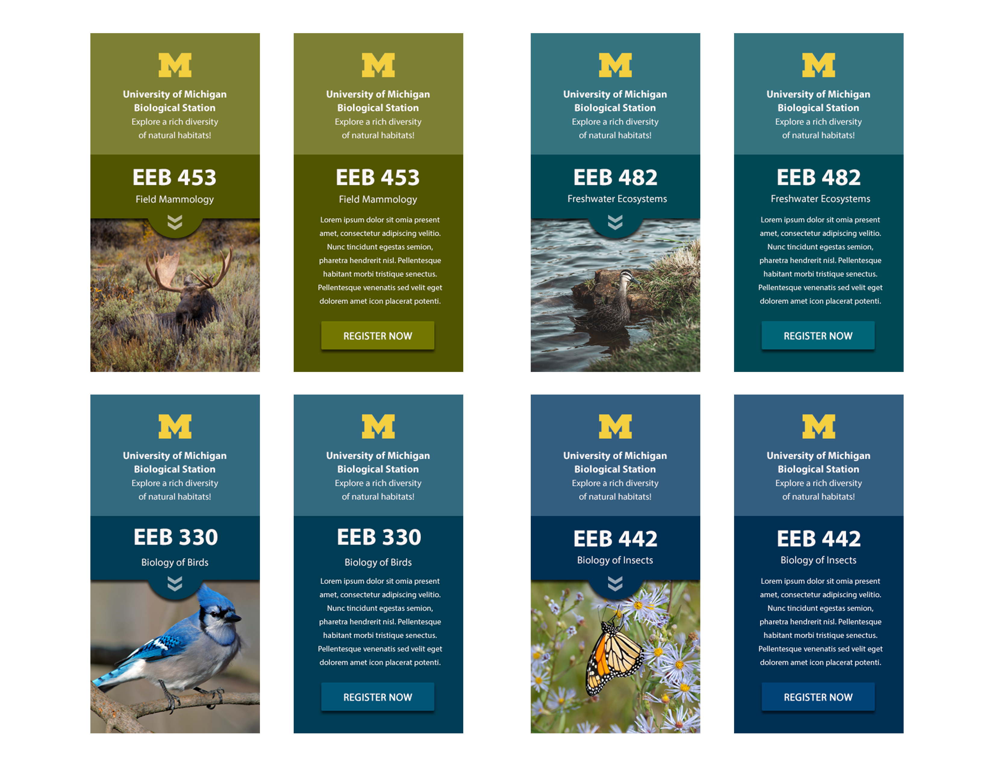
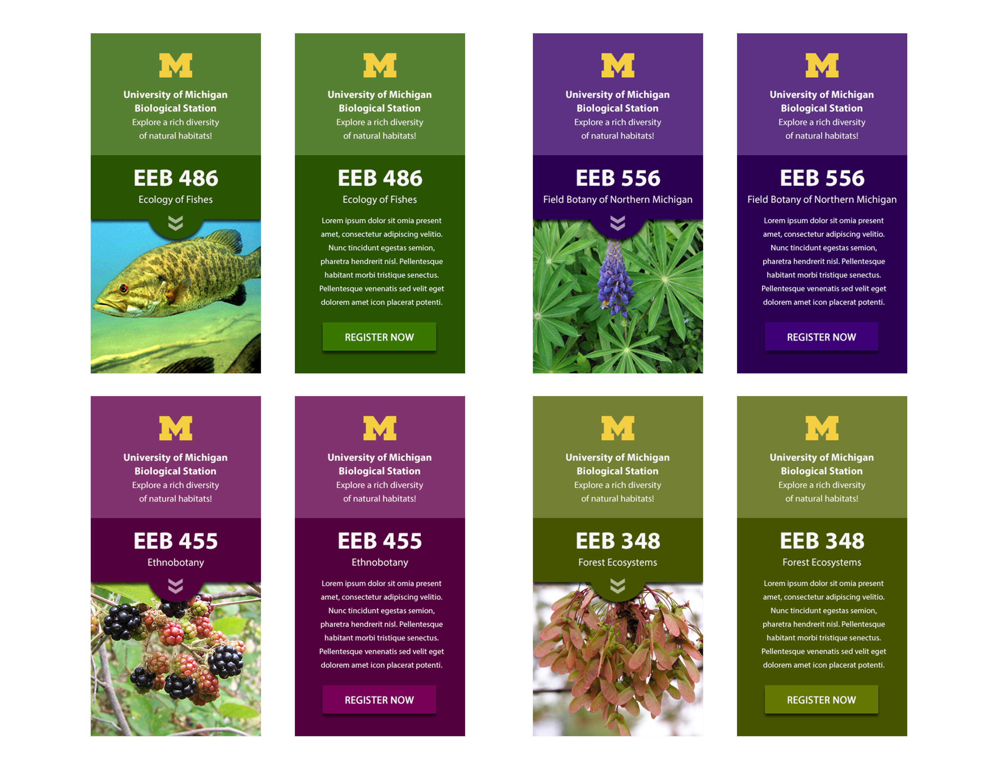
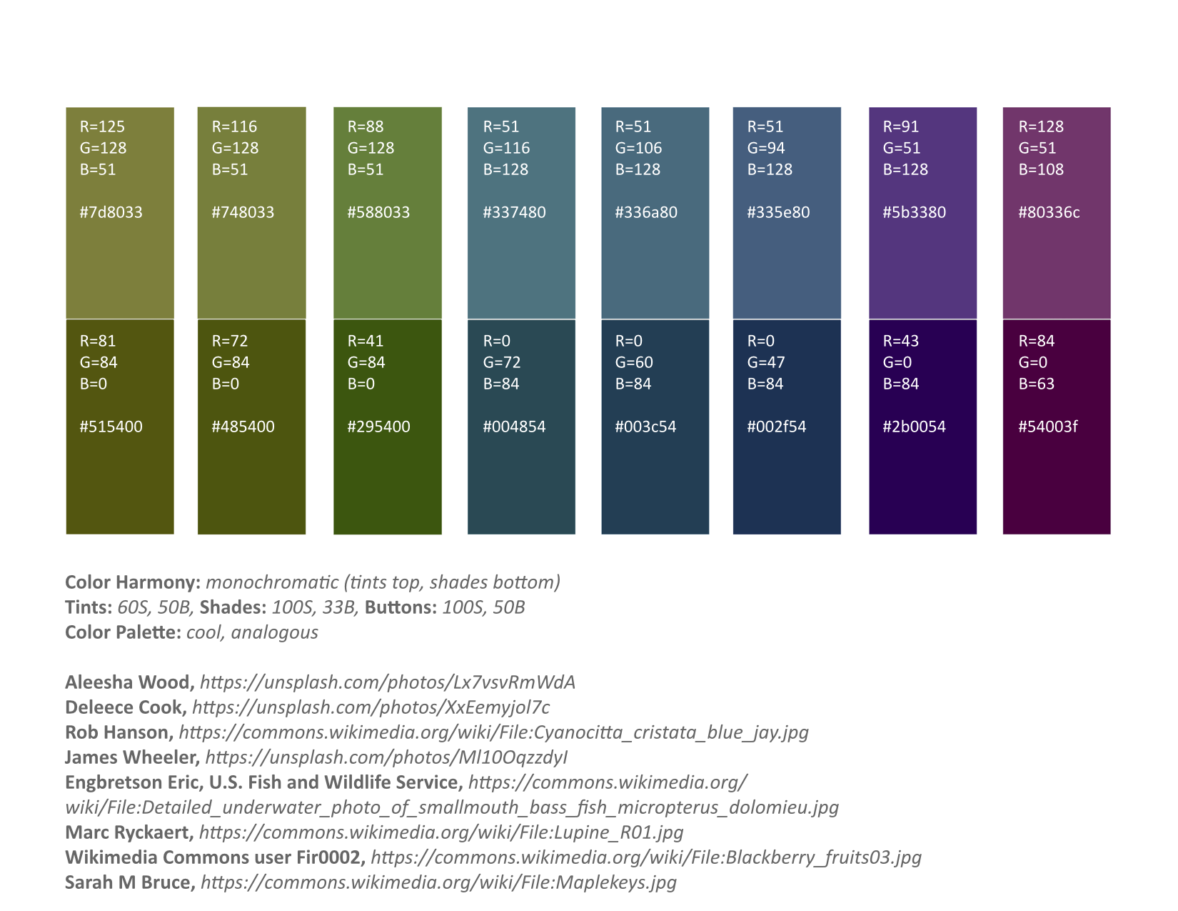
Course Web Banners
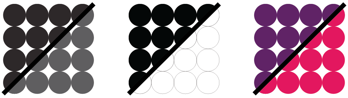
These were an exercise in color harmony; how to find color palettes that work in serialized work so that individual items have internal color harmony while the series of items maintain collective harmony at the same time.
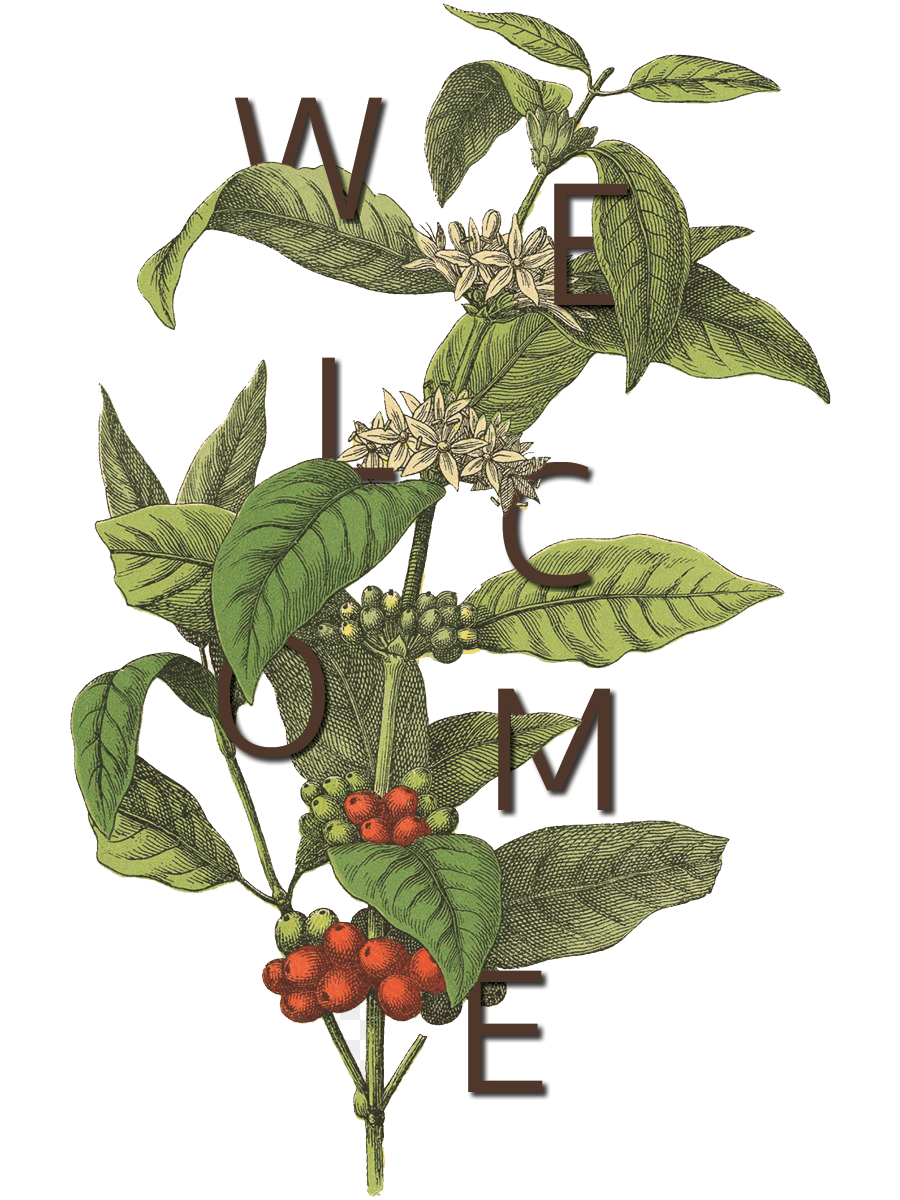
Botanical Collage
An exercise in layer manipulation, composition, and movement. I chose to embed the word 'welcome' into a botanical illustration of a coffee branch because coffee has cultural significance as a gesture of hospitality in many cultures, particularly in the Arab world. The letter placement was on the random side of the balance spectrum, but the composition as a whole is relatively symmetrical and the eye is drawn in a diagonal, dynamic pattern as the word is read.
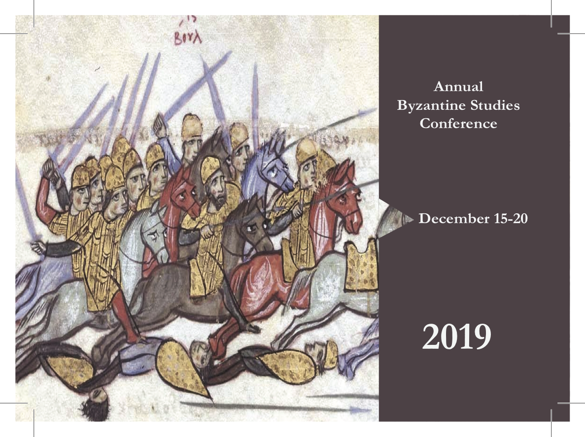
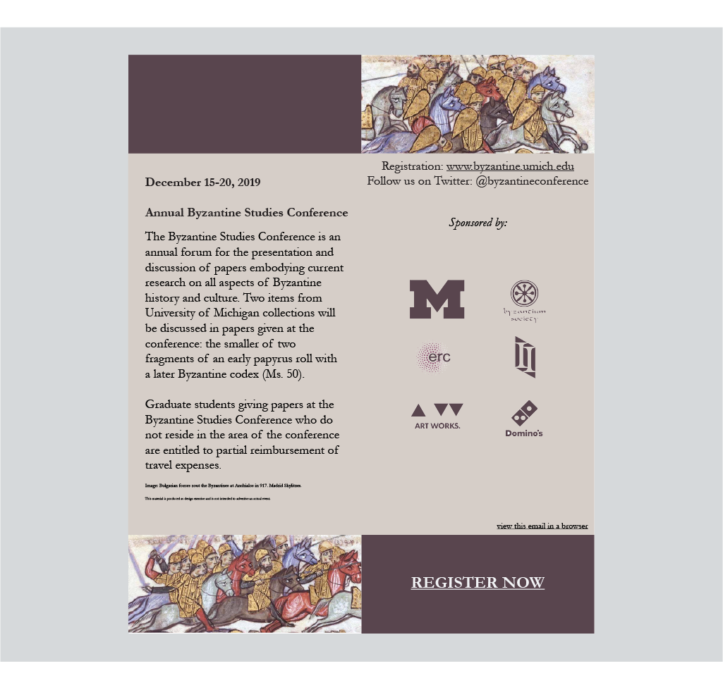
Conference Material Package
An aesthetically unified package of event invitation materials: both a physical postcard and styled email that stand out and incorporate thematically Byzantine imagery, color selection, and typography to entice an intended audience of academics in the field in general, but graduate students in particular. The tone of the messaging (and hopefully the imagery) is welcoming yet professional.
ABC's of Musical Instruments Poster
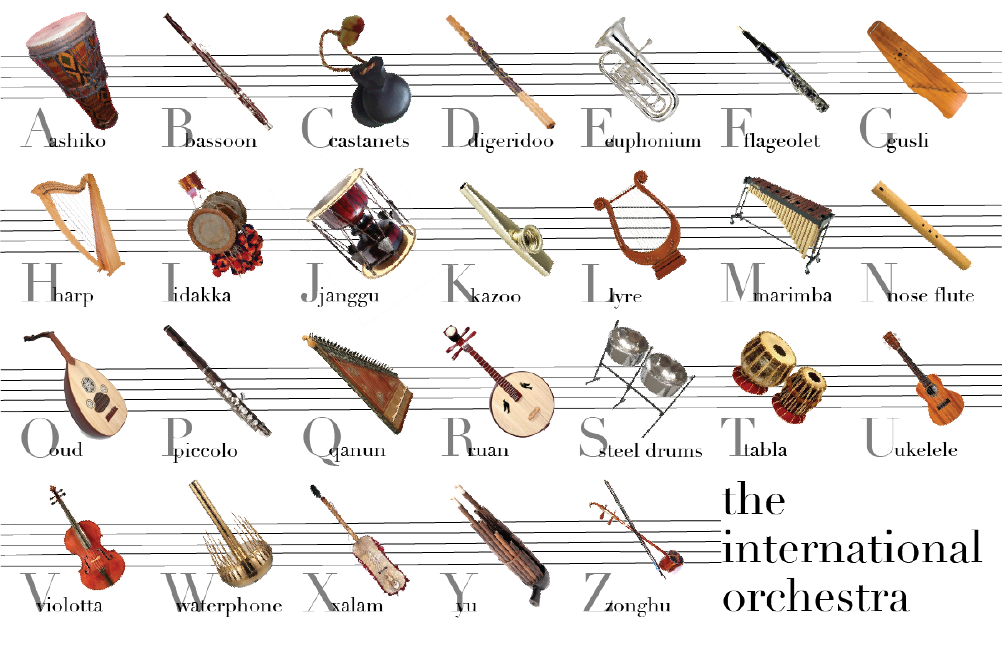
An application of modular grids and typographic aesthetics in design.The message of this poster was for music lovers specifically and people generally interested in music and music history; it meant to include instruments from all over the world from many traditions and highlight that not just instruments from a the tradition of Western European classical music are deserving of prestige and reverence. Didiot, based on Bodoni and Baskerville to some extent, was selected as the most “expensive” looking font in a survey of 368 people by typographer Sarah Hyndman, so I found it appropriate to convey this message by juxtaposition with this diverse set of instruments.
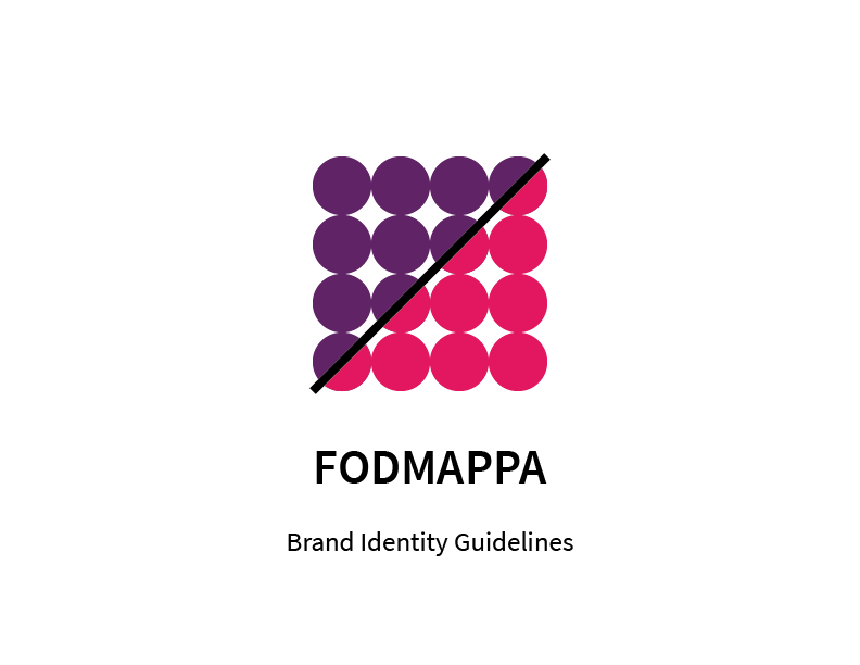
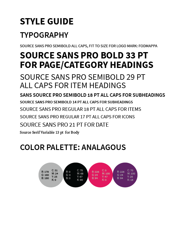
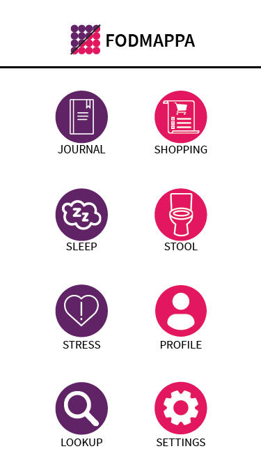
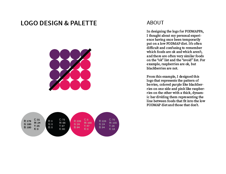
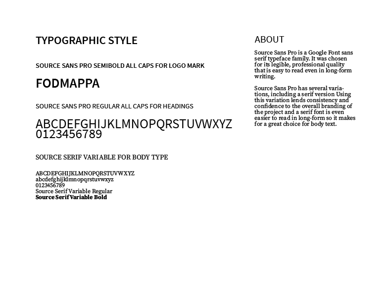
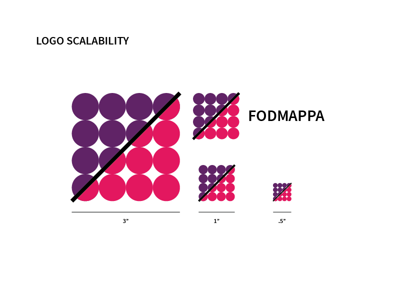
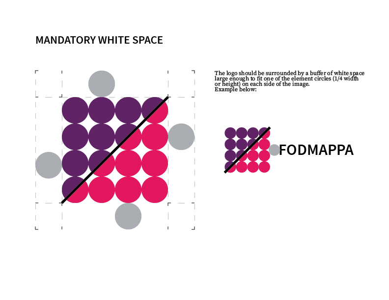
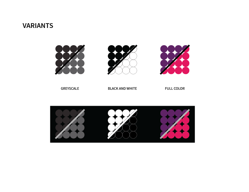
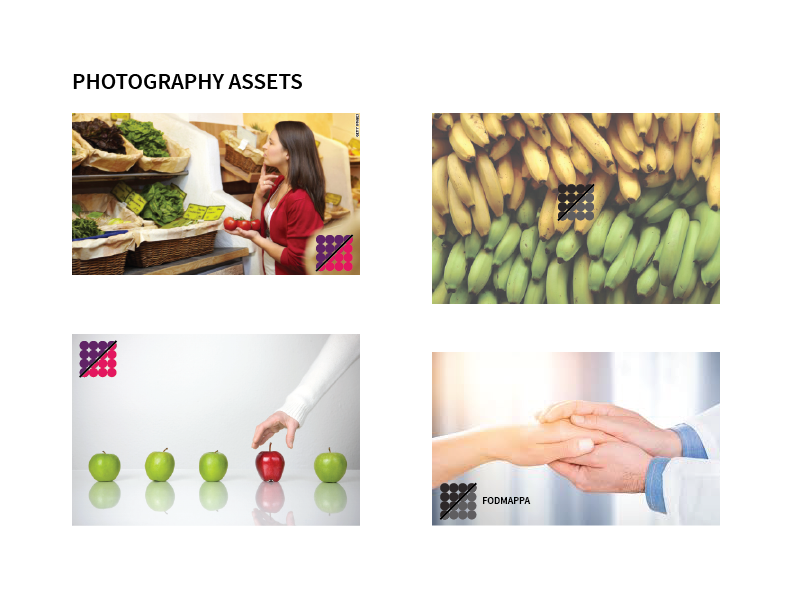
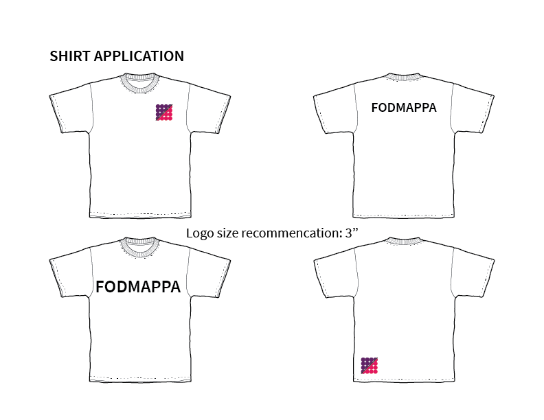
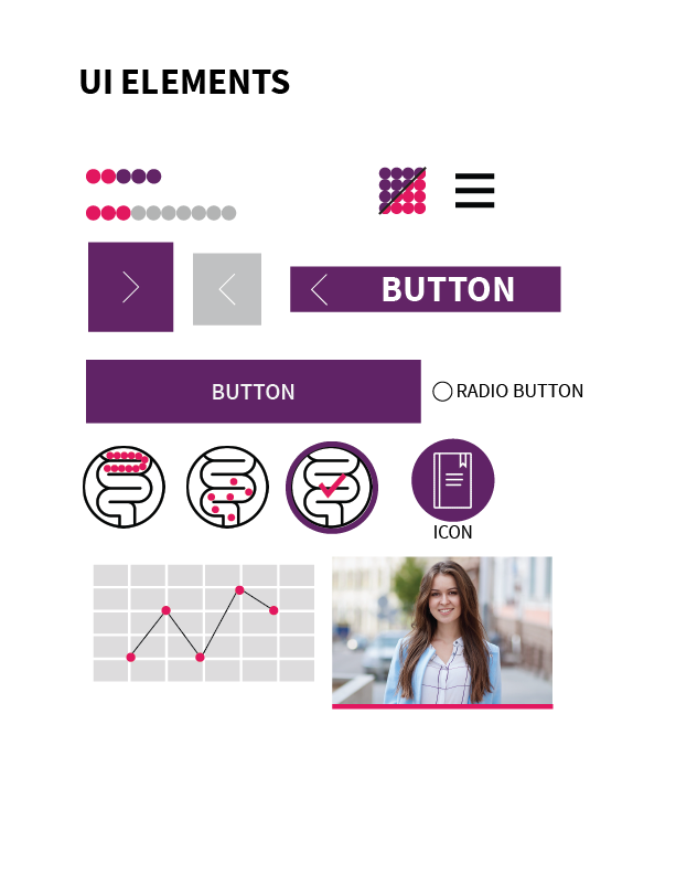
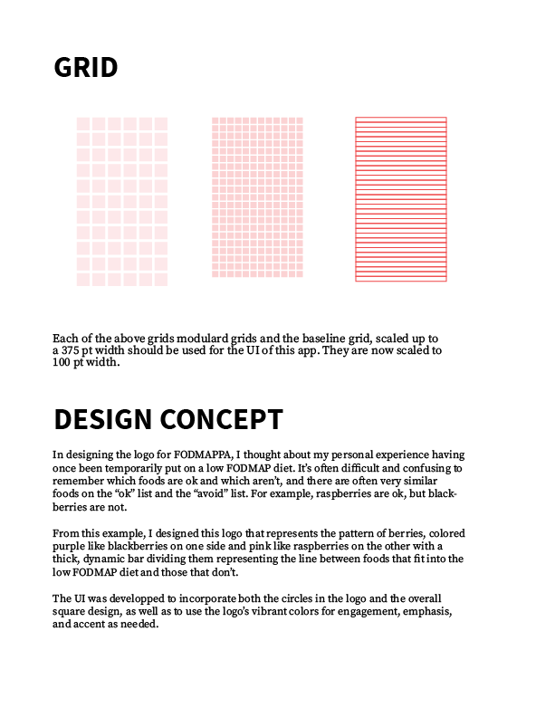
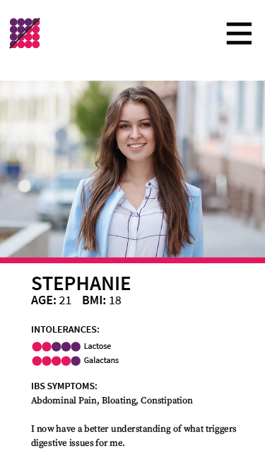
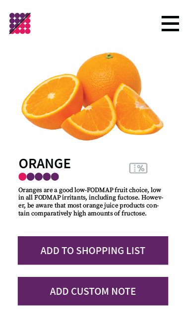
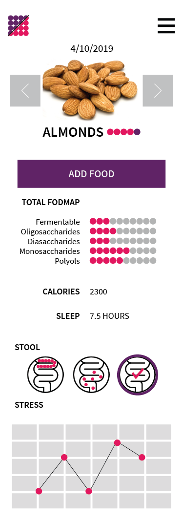
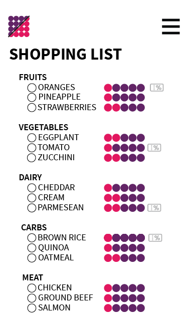
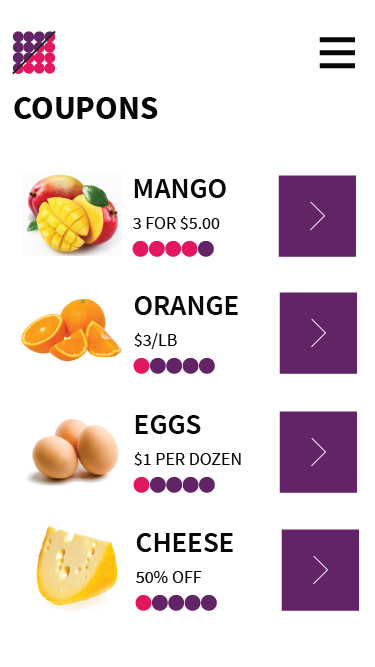
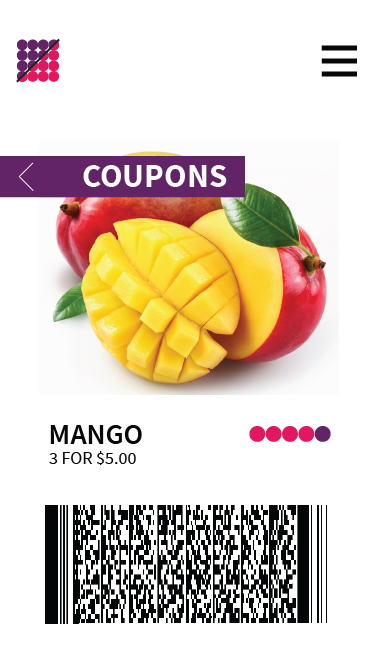
FODMAPPA App Branding Kit & Development
The last several weeks of class were spent developing and creating medium fidelity mockups of an app through which IBS patients can track their eating habits and symptoms, communicate with their healthcare providers, look up FODMAP ratings on the foods they eat to see if they will exacerbate their symptoms, and look for cupons for the foods in their meal plans.